Introduction
CSS3 introduces new powerful capabilities for web designers. Instead of merging several sub-images to generate a rounded button, CSS3 allows to define this button with properties.
This tutorial will not only expose the CSS3 instructions to create the button. The new GWT2.0 ClientBundle facility will be used to create a GWT RoundedButton.
The basic GWT Button will be used with a dedicated CSS3 style provided by a ClientBundle.
Let’s go !
ClientBundle introduction
GWT2.0 introduces this new functionality bringing the power of combining and optimizing resources into one download for things like text files, CSS, and XML. This means fewer network roundtrips, which in turn can decrease application latency, especially on mobile applications.
More information regarding ClientBundle can be found here.
Step1: Creating the CSS clientBundle
The .iPush style is used to polish the button in the “normal state”. Basic attributes like color, font and positioning are described in this section. As CSS3 webkit implementation is used, you can notice that a \ is added in front of the webkit. without this \, GWT compile will fire an error during compilation.
The .iPush.IBClassic is used to add the rounded button properties. A “templated button image” is required to define the button properties. This image will automatically adapt is size regarding the text contained in the button or the button forced width.
@url annotation is used to define the “templated” image required to design the button(lines 182-183).
- the @url annotation will produce the url CSS instruction
- the imageUrl1 is the image referenced in the CSS instruction
- the bigButtonWhite is a reference to a property defined in the ClientBundle java file in charge of locating the image (.png). This java file will be presented just after…
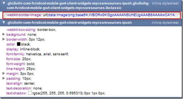
If we take a look at the generated CSS with the Chrome developer tools, we can see that the image has been base64 encoded during the GWT compilation !! no additional network access is used to download the image.
Step2: Creating the Java ClientBundle
The Resources interface is used to define all the resources (CSS files, images, JavaScript..) that are part of the bundle.
The previous CSS file is referenced by the @Source(“test.css”) annotation, the image location defined in the CSS file is defined in this interface as well.
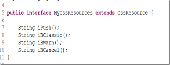
An other interface (MyCssResource) returned by the previous Resources interface is used to access the styles defined in the CSS file.
Using the button in the application
GWT.create method retrieves the Resources interface (56).
The button is “styled” with the MyCssResources iPush and iBClassic methods. This 2 methods are related to the .iPush and .iPush.iBClassic defined in the CSS file.
Finally, the resource is injected to the component (60)
And the result is:
Conclusion
This tutorial was for me the occasion to test the ClientBundle provided by the new GWT2.0 framework. Using ClientBundle seems really a good way to reduce the network transfers and only use the “active” part of the CSS.
Special thanks to Thomas Broyer who provide me efficient support !


